
Related resources
Storybook:
AEM components:
- Awaiting delivery
AEM status:
Demo

Usage
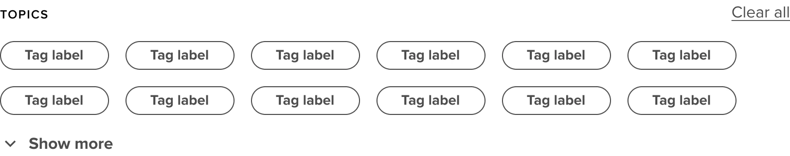
Overview
When to use
Whenever a user, while searching, has a bigger list of results. The tag cloud can help narrow down the user’s search by letting the user select whatever category the user wants to search in.
How to use
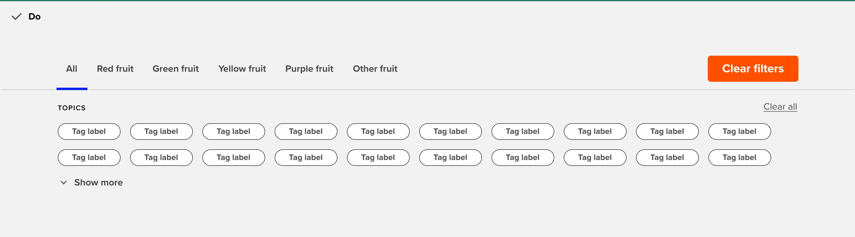
Tag clouds are always placed under a page nav. Depending on which tab of the page nav is active, tags are shown. Upon selecting tags, the content under the tags will change. Multiple tags are selectable.
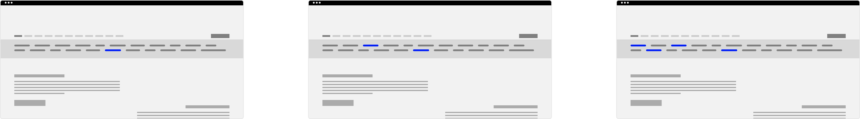
Tag cloud web
Use when there is a clear call to action on the page. This button should be the most prominent element on the page. When there are more than 2 call to actions on the page consider using links instead.
General Do’s
Provide enough contrast so the copy is readable. Use the dark and light versions accordingly.
To create more contrast, when needed, use a gradient on the background image.
Use ‘all’ as a first ‘collection’ option in the pagenav.
Use a logical order for your tag collection.
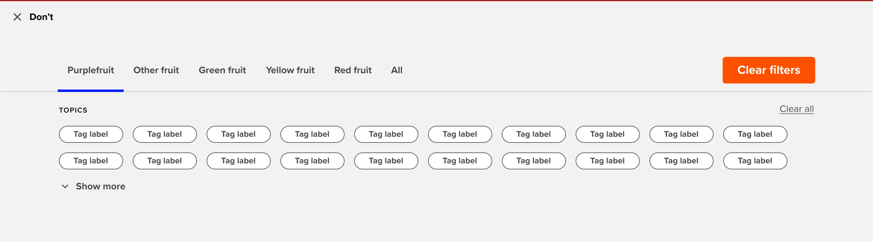
General Don’ts
Do not use buttons and links all at once. Choose which CTA suits your use case best.
If the purpose of the call to action is to take the user to a destination, consider using a link instead
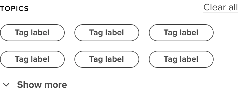
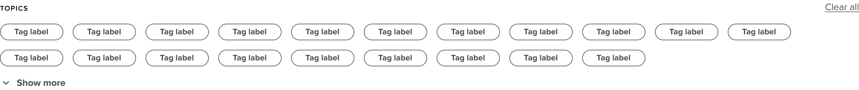
Show too many tags at once. Hide behind ‘show more’
Don’t use long tag names
Example
Anatomy
Anatomy overview
| No. | Function | Description |
|---|---|---|
| 1 | Smallcaps | The menu item that is currently active, by default the first item is active |
| 2 | Heading | Can either be a button, primary link or social share |
| 3 | Copy | The menu item that is currently active, by default the first item is active |
| 4 | CTA | Can either be a button, primary link or social share |
| 5 | Background | Can either have a dark, light or no gradient. |