
Related resources
AEM components:
- Awaiting delivery
AEM status:
Demo


Usage
When to use
Whenever a button is too much presence for your CTA and you are looking for a more subtle approach.
How to use
Just like buttons, links are usually placed at the end of content and can be aligned along with the text supporting it. The preferred icons to use are the arrow (left or right, depending on position of the icon) or external. But when needed we can also replace these preferred icons with whatever we need in the situation.
General Do’s
Try to use the preferred icon for this component
Use If the the call to action takes the user to a new destination
Use the secondary one if you want to make a list of these
Make sure you swap the arrow when using a prefix position
Use if you need a less rpominet call to action then the buttons
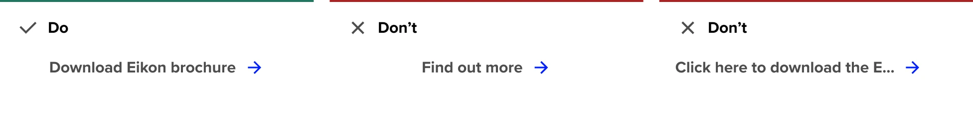
Labels should lead with an action
Write in sentence case
Provide clarity on where the user is taken
Write clear, short, sentences
General Don’ts
Use the dark and light themes of this component accordingly
Do not place two primary links next to each other
Do not change the color of our presets
Try not to rely on the context or surrounding content
Don’t include punctuation
Example
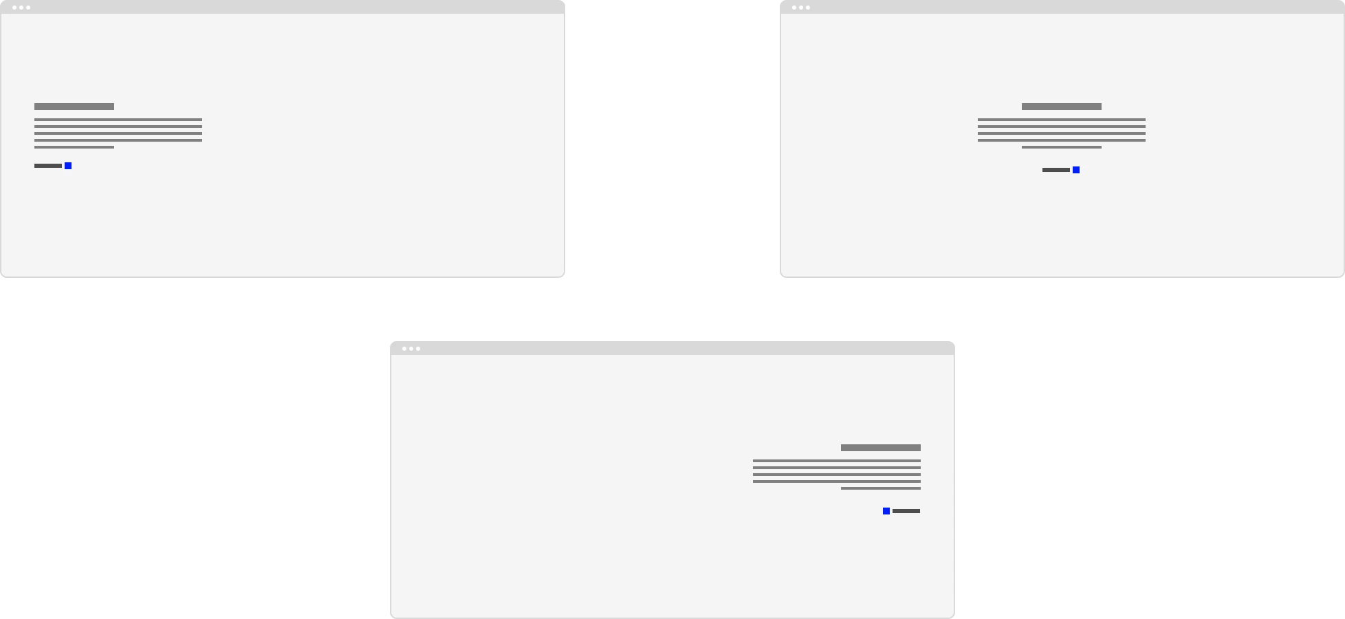
Anatomy

Anatomy overview
| No. | Function | Description |
|---|---|---|
| 1 | Label | Short but clear exlaination of where it links to when clicked |
| 2 | Icon | Supportive icon, prefered arrow or external icon. |