Related resources
AEM components:
- Awaiting delivery
AEM status:
Standard Examples
Financial Data Examples

Horizontal: small values

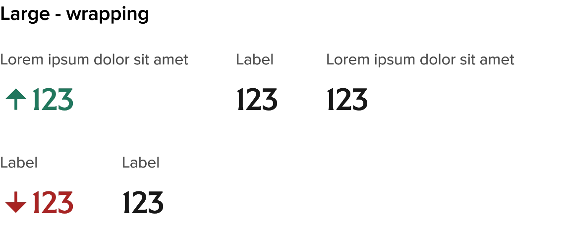
Horizontal: large values

Usage
How to use
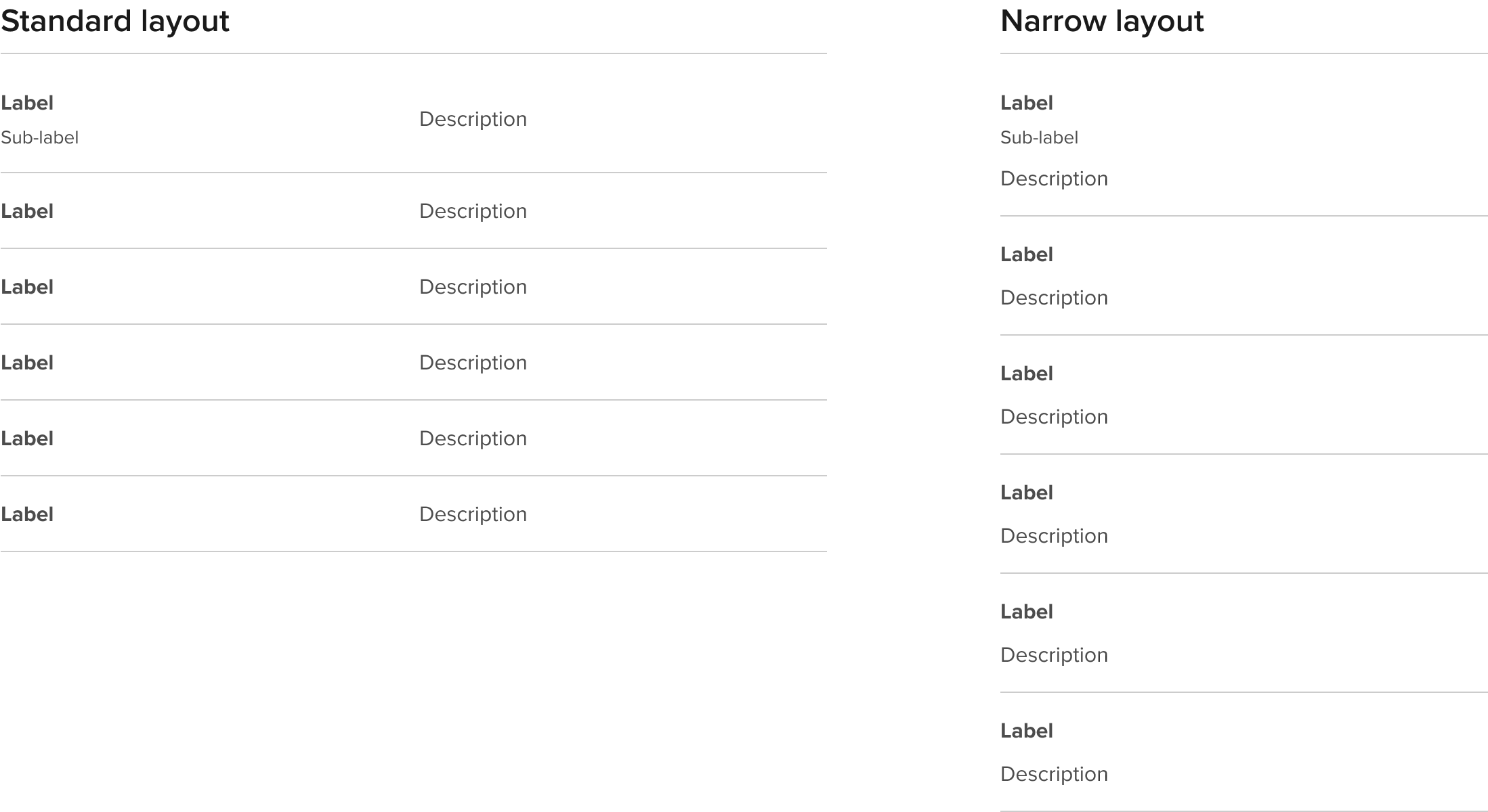
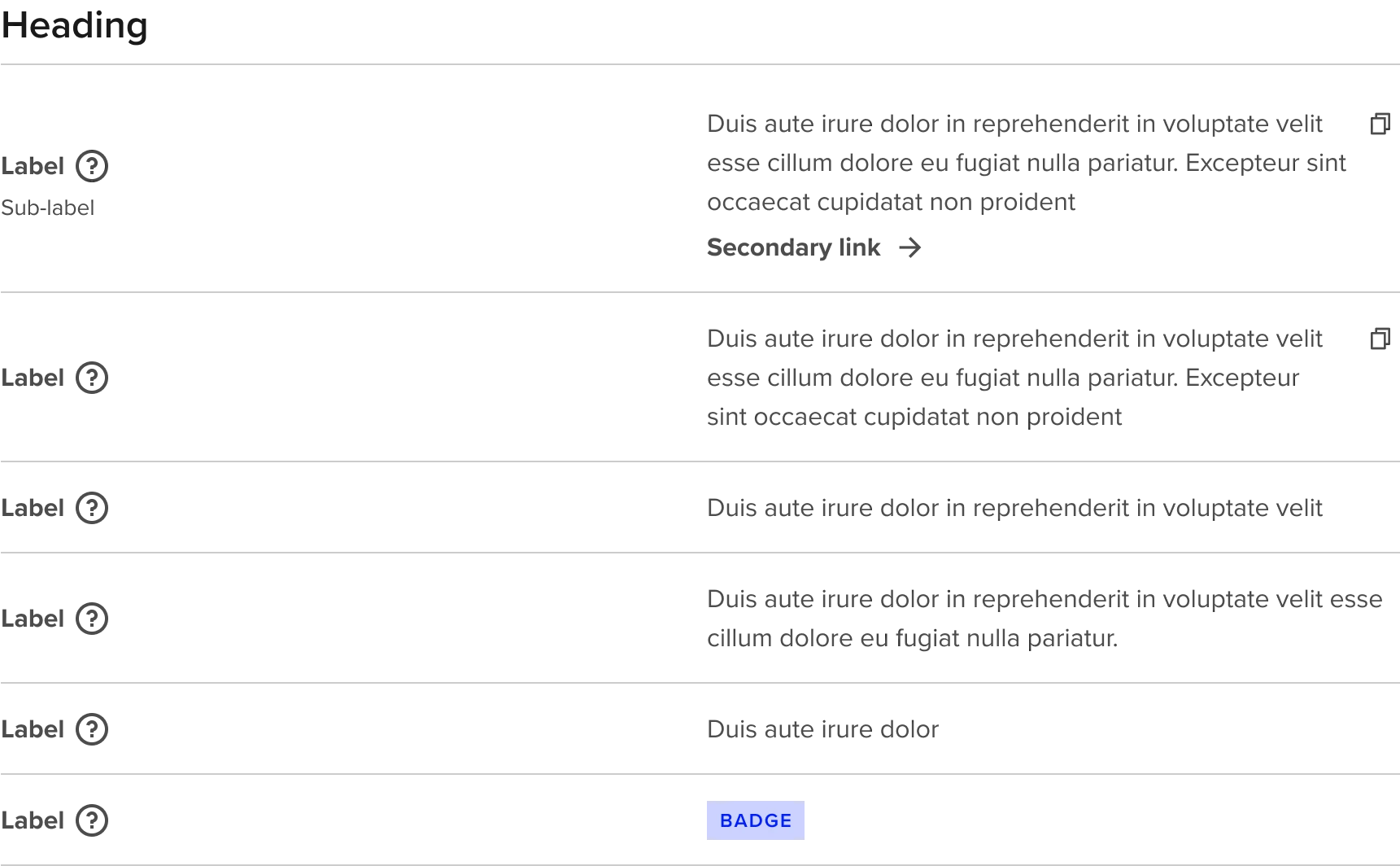
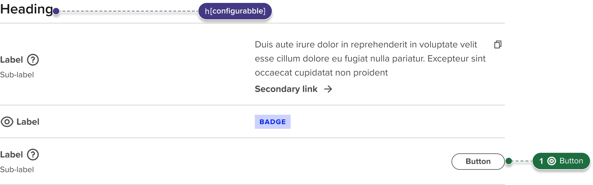
Use the Rich text grid as a standalone component within a page section or Section Frame. Set the Layout option based on your content which will be primarily based on the width of labels with any instance. Columns can be evenly split but there are also options to set the label column to Narrow (160px), Medium (248px), or Wide (328px). Tooltip icons are optional and the description area can include a simple description, description + link, or a badge component. When including the tooltip icon you will need to override the default auto-layout settings for the Label from “hug” to “fill” when text is longer than the field width to get the label/icon pair to wrap appropriately with the available space.
General Do’s
Keep labels and values clear and concise
Select layouts that reflect the right balance between row labels and values
Try to maintain uniformity of style, extent of content, and types of actions across an instance or rich text grid
General Don’ts
Avoid lengthy descriptions or density of content. Grids should be scannable
Don’t include too many competing actions of different types
Standard Variants and Properties
| Property name | Property type | Description | Values | Default value |
|---|---|---|---|---|
| Type | Variants | Two main types:
| Standard Financial Data | Standard |
| Description size | Variants | Allows for a smaller description text size for longer description content | Default (P1) Small (P2) | Default |
| Layout – Standard variant | Variants | Controls the width of the Labels column with the "Description" cells filling the remaining available space | Even split, Narrow labels, Medium labels, Wide labels | Default |
| Row height | Variants | Compact option reduces the top and bottom padding by half (16 to 8px) and removes the dividing line between rows | Default Compact | Default |
Standard row variants and properties
Rows have configuration options that are applied at the row level to support
varying extent of content and actions in context.
| Property name | Property type | Description | Values | Default value |
|---|---|---|---|---|
| Tooltip | Boolean | When enabled this includes an authorable Tooltip Icon to the right of the Label | True False | False |
| Contextual icon | Boolean | Adds a decorative contextual/category icon to the left of the label. Uses the Icon component at 24px and any icon from the UI icon set can be used | True False | False |
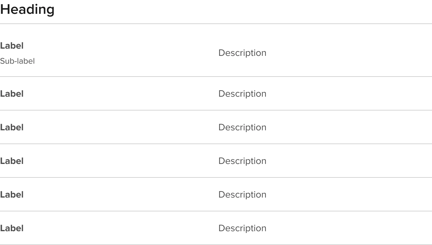
| Sub-label | Variants | Adds optional sub-label in smaller type for additional context | True False | False |
| Descripton style | Variants | Provides a range of options for description type and/or associated actions | Text | Text |
| Copy button | Boolean | Labels are authorable | Free text | Button |
Financial data variants and properties
| Property name | Property type | Description | Values | Default value |
|---|---|---|---|---|
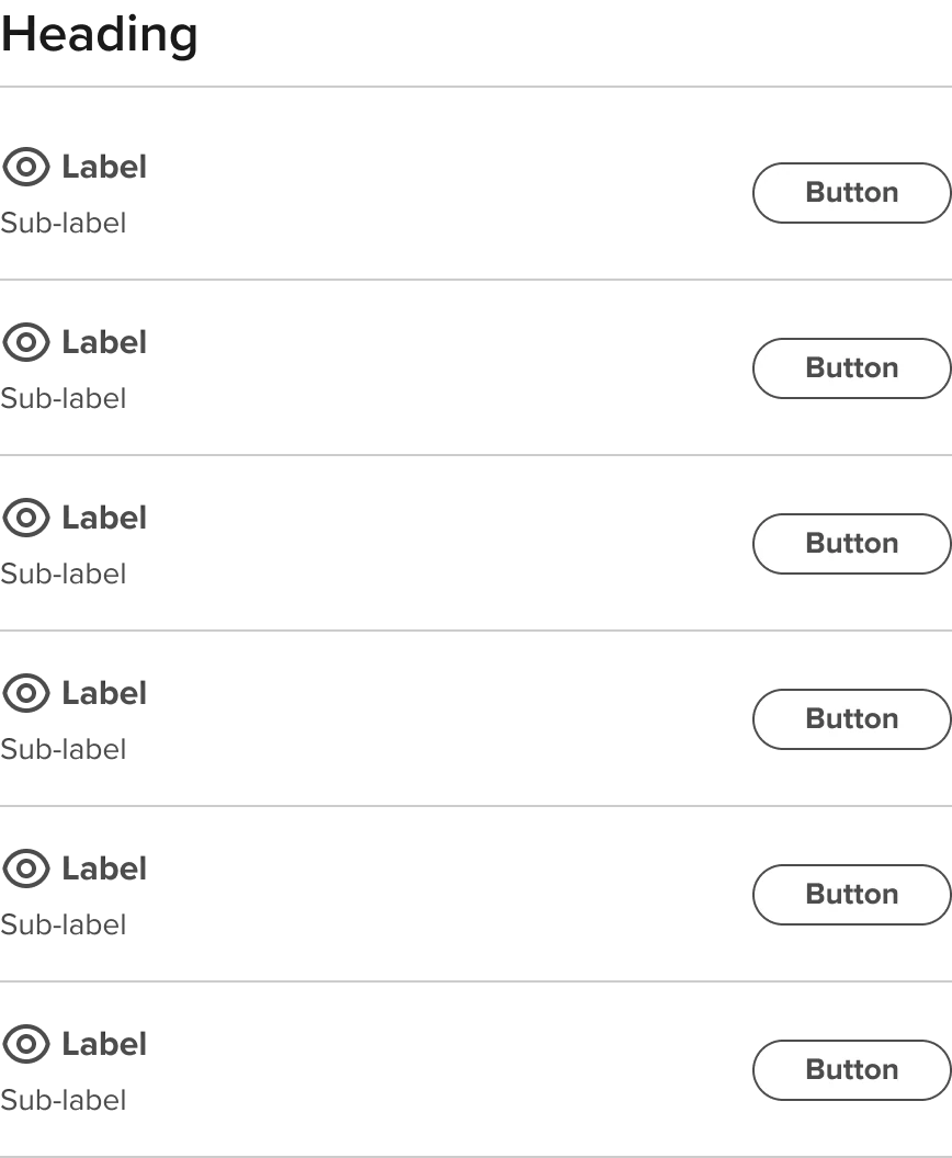
| Layout | Variants | Four available layouts that support varying content widths and content options | Standard | Standard |
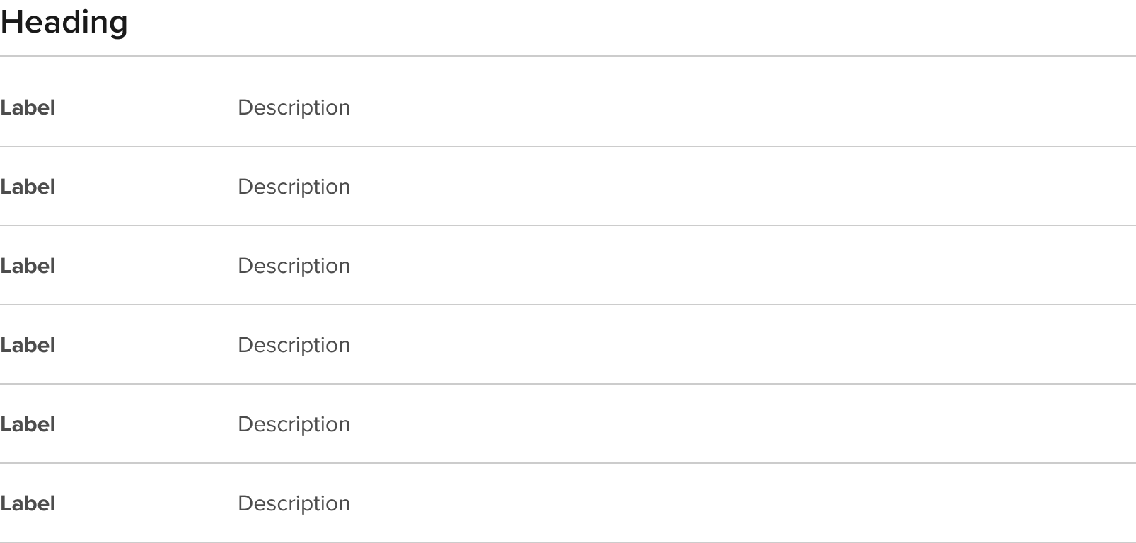
| Heading | Boolean | When enabled it includes a configurable Header of the RT Grid instance. Standard and Narrow layouts only | False True | True |
Financial data row variants and properties
Rows have configuration options that are applied at the row level to support
varying extent of content and actions in context.
| Property name | Property type | Description | Values | Default value |
|---|---|---|---|---|
| Tooltip | Boolean | When enabled this includes an authorable Tooltip Icon to the right of the Label | False True | False |
| Contextual icon | Boolean | Adds a decorative contextual/category icon to the left of the label. Uses the Icon component at 24px and any icon from the UI icon set can be used | False True | False |
| Sub-label | Variants | Adds optional sub-label in smaller type for additional context. Standard and Narrow layout only. | Even split | Default |
| Value cell type | Variants | Provided different styling and associated informative icon for Standard (neutral), Gains (positive), and Losses (negative) | Standard | Standard |
Variants and properties examples
Default text size and height without icons
Narrow layout
Desktop with Tooltip and Link + text description variant, and Copy description examples
Compact height - small text - narrow labels - no Tooltip

Default height - standard text - narrow labels - contextual icon - sub-label - button in description area (right aligned)
Related components
Component serving similar functions
| Components | Description |
|---|---|
| Data Table | Pulling the description from the overview content |
| Rich Text | For the principal call to action on the page. Primary buttons should only appear once per screen (not including the application header, modal dialog, or side panel). |
Sub-components
Reusable components used with this component or sub-assets that drive its content or functionality
| Components | Type | Description |
|---|---|---|
| Rich Text Grid Rows | Sub-component | Pulling the description from the overview content |
| Rich Text Description | Sub-component | For the principal call to action on the page. Primary buttons should only appear once per screen (not including the application header, modal dialog, or side panel). |
| Value cell type | Sub-component | For the principal call to action on the page. Primary buttons should only appear once per screen (not including the application header, modal dialog, or side panel). |
| Section header | Reusable component | For the principal call to action on the page. Primary buttons should only appear once per screen (not including the application header, modal dialog, or side panel). |
| Tooltip icon | Reusable component | For the principal call to action on the page. Primary buttons should only appear once per screen (not including the application header, modal dialog, or side panel). |
| Badge | Reusable component | For the principal call to action on the page. Primary buttons should only appear once per screen (not including the application header, modal dialog, or side panel). |
| Pill button | Reusable component | For the principal call to action on the page. Primary buttons should only appear once per screen (not including the application header, modal dialog, or side panel). |
| Secondary link | Reusable component | For the principal call to action on the page. Primary buttons should only appear once per screen (not including the application header, modal dialog, or side panel). |
Accessibility of Rich Text Grids
RT Grid Standard
RT Grid Financial data horizonal

RT Grid Financial data horizonal

Non-standard reading order: per mobile layouts
Accessibility overview
| Function | Description |
|---|---|
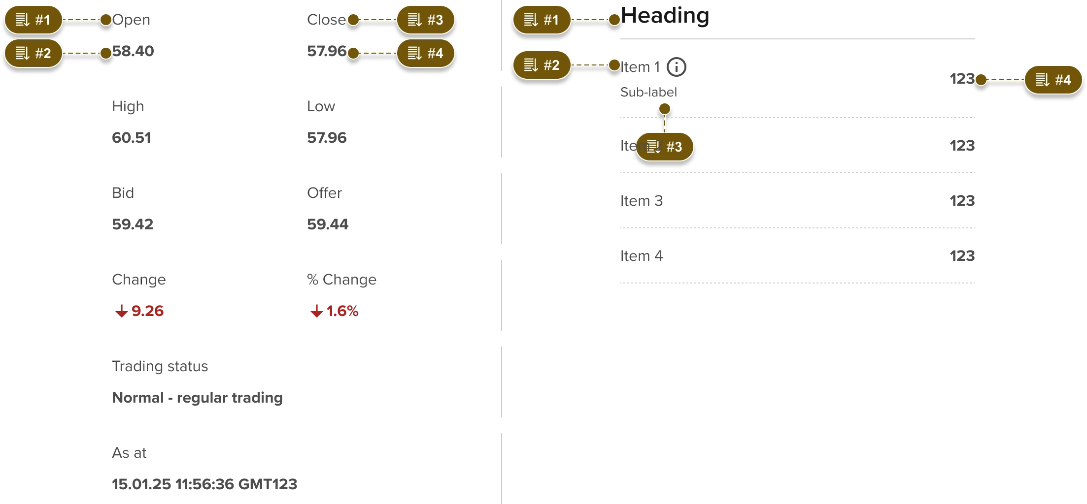
| Reading order | Reading order is left to right then top to bottom unless otherwise specified here. |
| Tab order | Tab order is left to right then top to bottom unless otherwise specified here. Visible focus should utilize Forge Focus state styles |
| Heading level | Since this component will sit within a page hierarchy all Heading levels will be dependent on where it sits in that hierarchy. Both the heading size/style and semantic heading level should be independently configurable per the Section header component. Heading levels are not needed inside a semantic table. |
| Aria | Available for icons and interactive elements in the page as aria or aria-labelledby where appropriate. Note that the preference is for buttons to use specific visible labels where reasonable to do so and reserve usage of aria-labelledby for actions with generic labels that require related context. Aria labels should be translated if the parent page changes language. This is simplified if using visible text or aria-labelledby, in the case where the aria label is not derived from aria-labelledby then ensure that the translated label is enabled to be switched by the page Negative and Positive icons should only be used in the context of showing “Gains” or “Losses” and the associated icons (“Up” or “Down” arrow) should include a matching “Up” or “Down” aria label. |
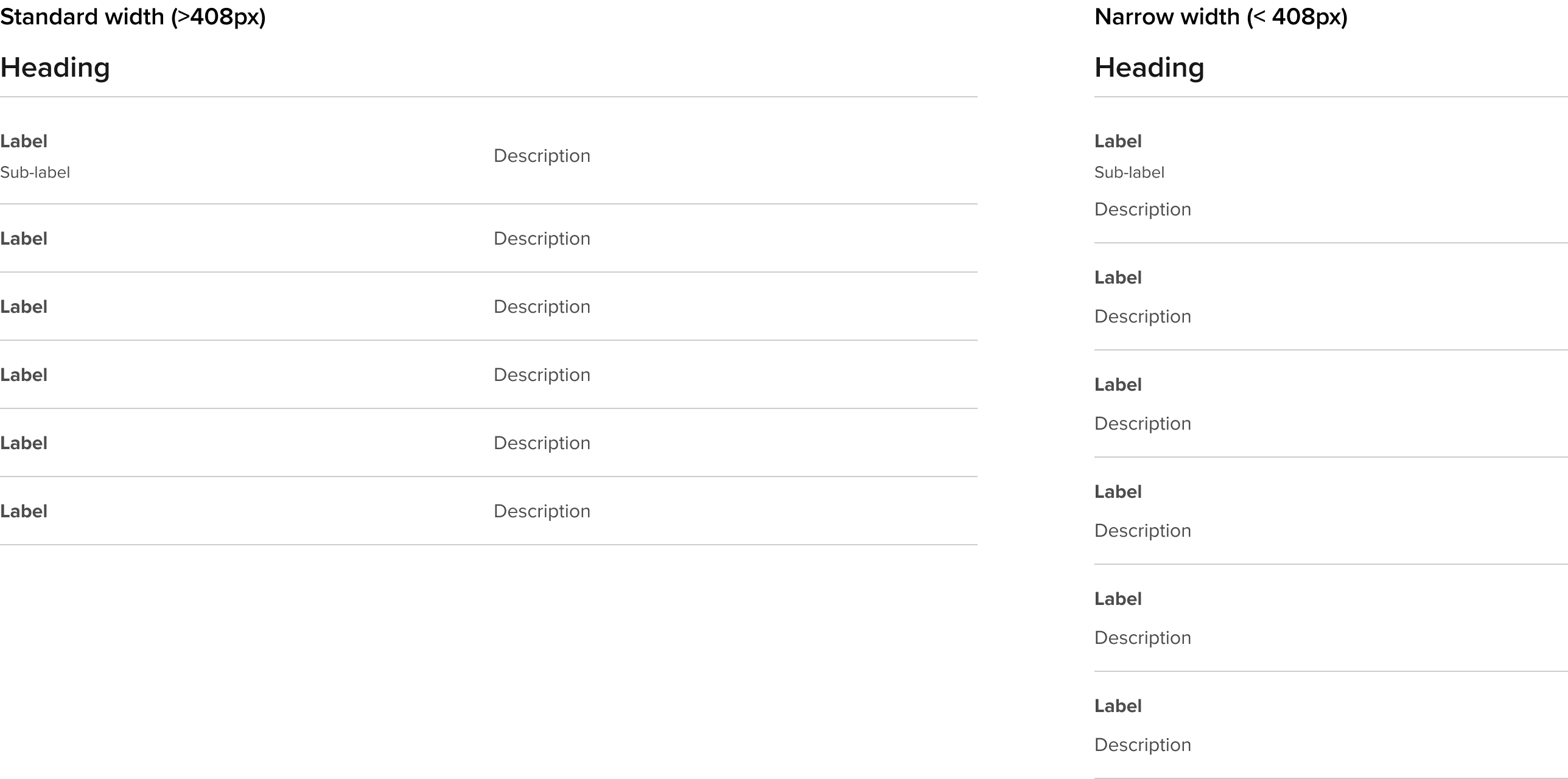
Responsive behaviour
Standard
Financial data standard
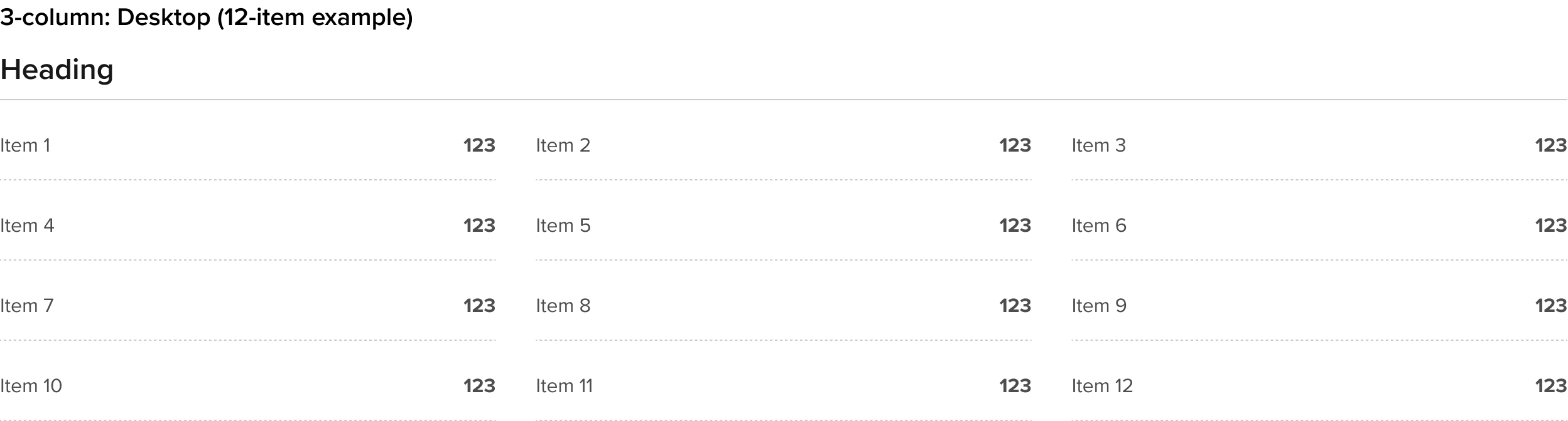
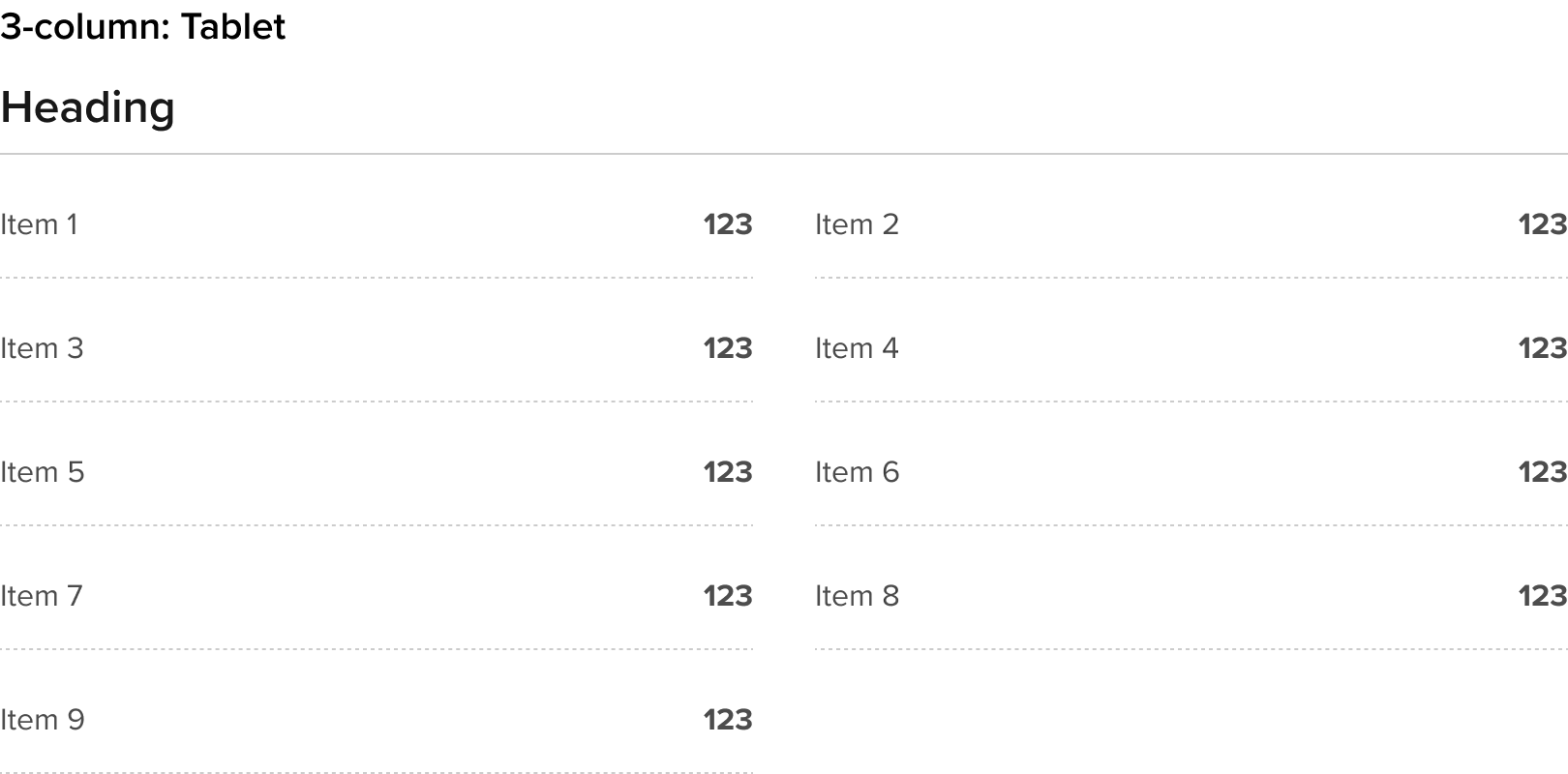
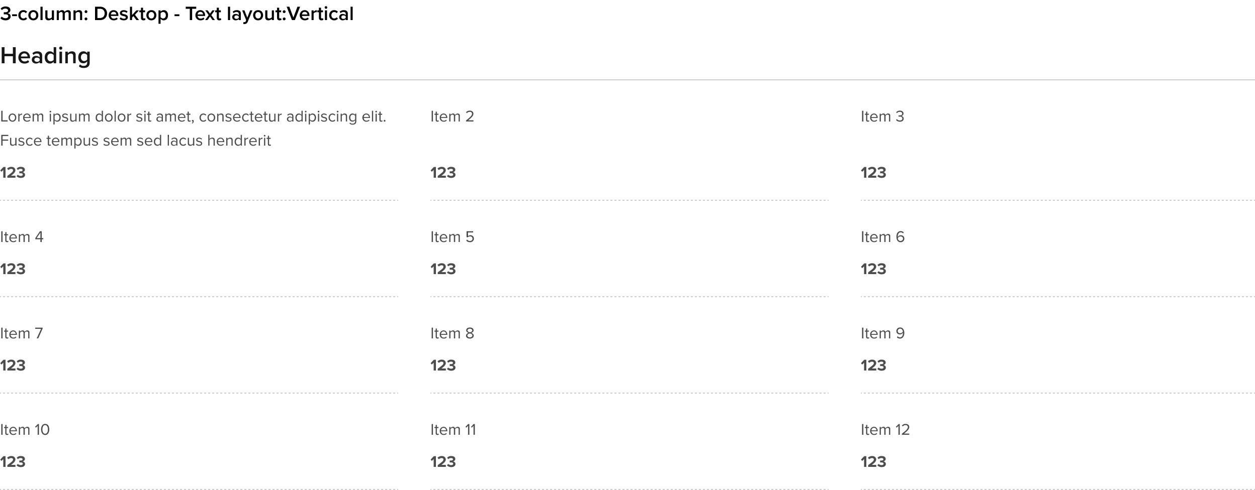
Financial data horizontal