
Related resources
Storybook:
AEM components:
- Awaiting delivery
AEM status:
Demo
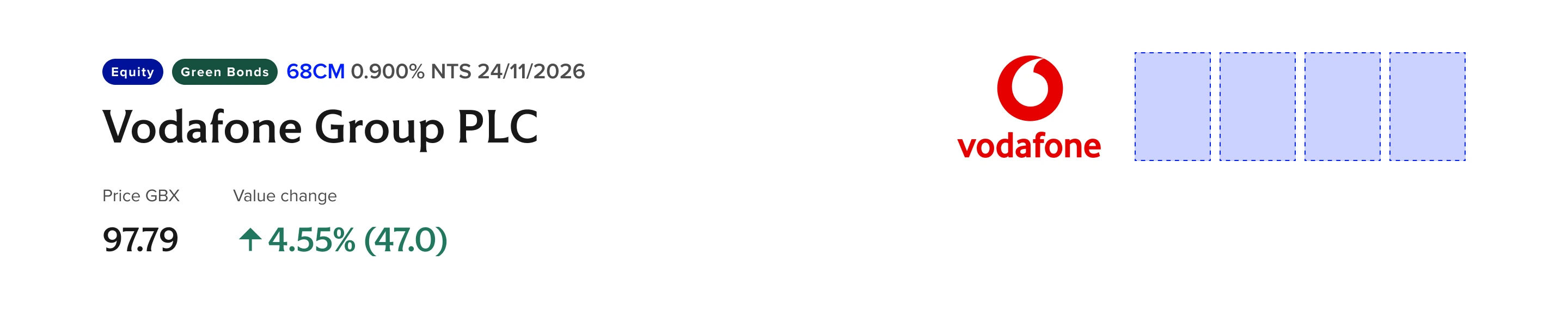
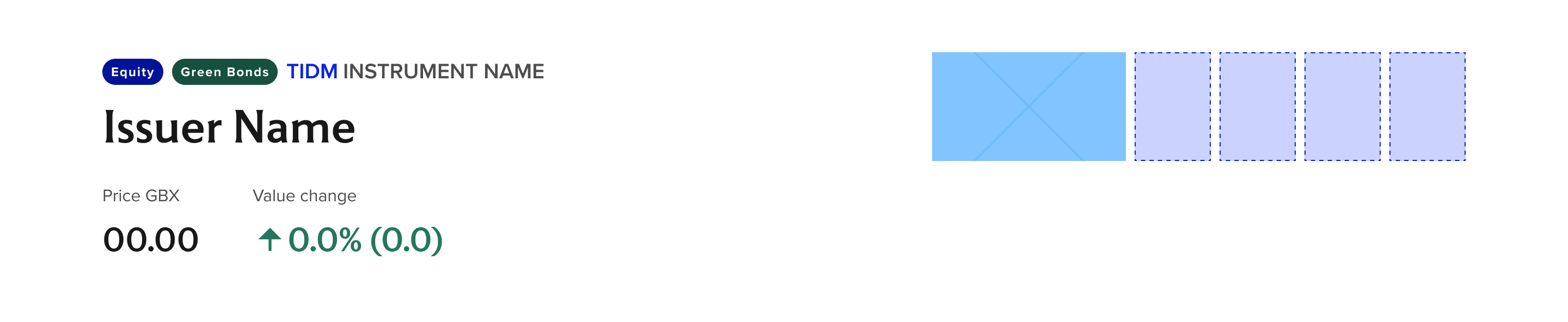
Instrument Hero
Sample of Instrument Hero component.
Variants and Properties
Variants and Properties
| Property name | Property type | Description | Values | Default value |
|---|---|---|---|---|
| Badge group | Boolean | Indicates category of the Issuer/Company with distinct color. | False True | True |
| Shield (1 to 4) | Boolean | Adds a contextual/category badge/s that Issuer/company holds. Uses the approved accreditation badge styles appro.70X100 in size | False True | True |
| Company logo | Boolean | Represents company logo. Uses appro. 178x100 in size. | False True | True |
| Value cell type | Variants | Provided different styling and associated informative icon for Standard (neutral), Gains (positive), and Losses (negative) | Standard Negative Positive | Standard |
| Breakpoints | Variants | Responsive layout for all type of devices | Standard Medium Small | Standard |
Usage
How to use
- Instrument hero component are specifically build to use within the instrument pages of LSE. Apart from default hero component this component consist of solid white background and shows the Issuer/Company name as H1 title. Along with the title it also allows to display company logo (approx. 178 x 100) and accreditation badges ( approx. 70x100) that Issuer/Company holds. Accreditation badges count are set to 4 maximum.
- The Badge component above the title is used to indicates category of the Issuer/Company such as Equity, ETFs, Bonds, Turquoise etc.. in different colours.
- RTE grid component is made use within this component to show the stock values of the Issuer/Company.
General Do’s
Only use the Instrument Hero component within the instrument pages
The background should remain solid white.
The Issuer/Company name should be displayed prominently as the H1 title.
The badge above the title should clearly indicate the category (e.g., Equity, ETFs, Bonds, Turquoise) with distinct colors.
General Don’ts
Do not use this component outside of the instrument pages.
Don’t Alter Background, avoid changing the background color.
Never display more than four accreditation badges.
Do not use irrelevant or generic badges. Only display badges relevant which are mentioned in the document.
Anatomy
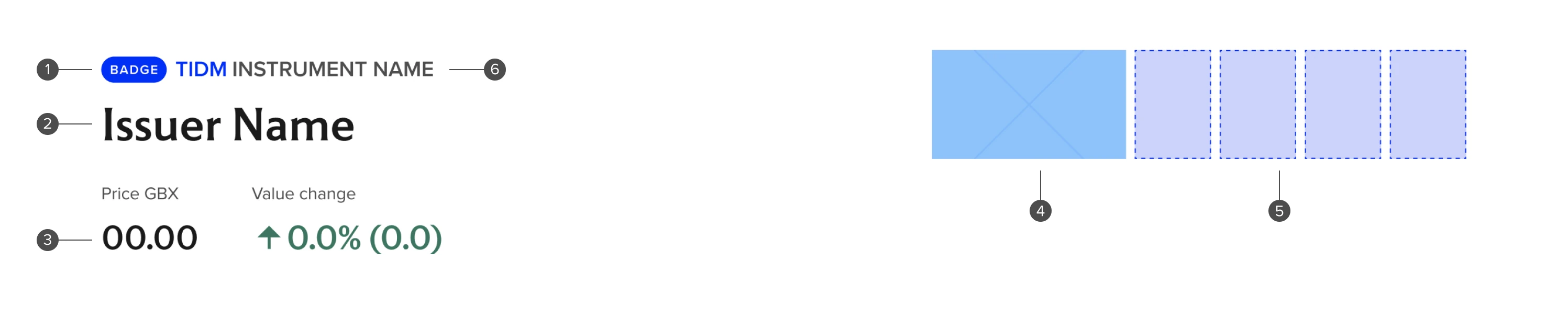
Anatomy overview
| No. | Function | Description |
|---|---|---|
| 1 | Badge | Represents category of the Issuer/Company belongs to. |
| 2 | Title | Name of Issuer/company. Should be H1. |
| 3 | Share price tracker | Indicates current share price values. |
| 4 | Company logo | Logo of Issuer/company. |
| 5 | Accreditation badges | Represents accreditation badges Issuer/Company received |
| 6 | Ticker description | Descriptive copy of ticker. |
Related components
Sub-components
| Name of component | Type | Description |
|---|---|---|
| Reusable component | Variant of Badge that has consistent labels and styles associated with each instrument type. Used here as a part of the Eyebrow element above the main heading | |
| Reusable component | Badge group allow 1-3 badges to be included in a responsive layout and includes all available styles of baddges which can be applied independently per badge within a group. Will be updated to incorporate the Instrument Categories badge type when delivered | |
| Reusable component | Horizontal layout of Financial Data Items with large values and positive/negative/neutral styles |
Responsive behaviour
Desktop

Tablet
Mobile
Accessibility
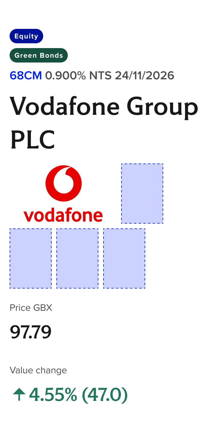
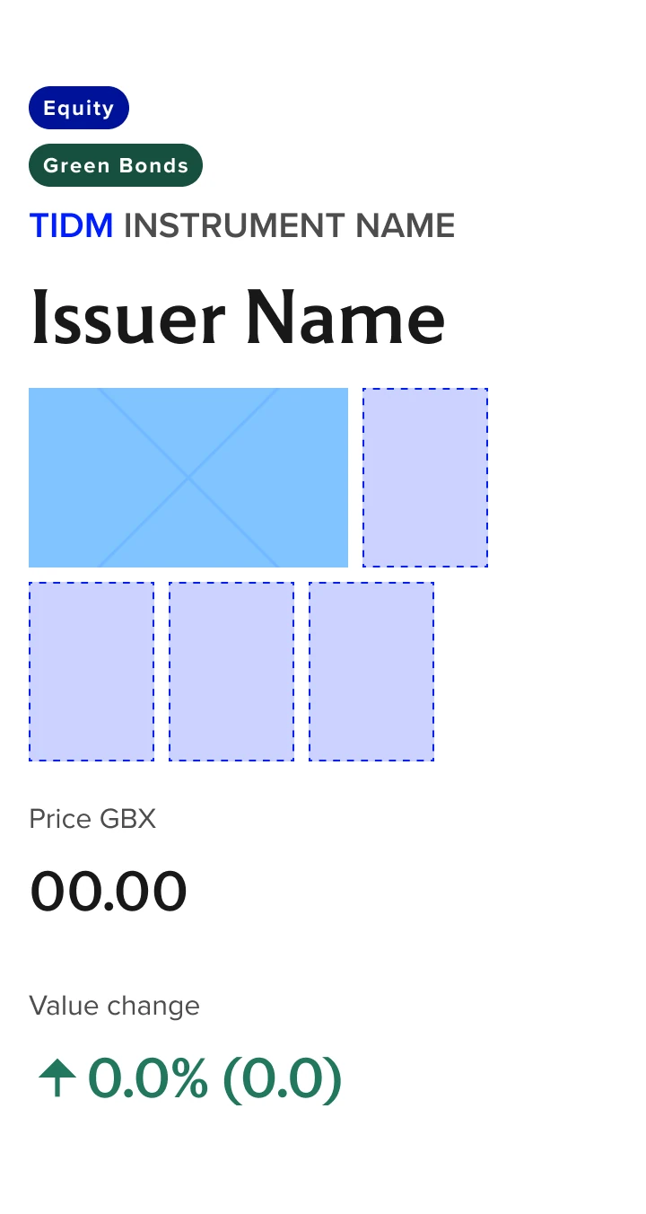
Instrument Hero
Instrument Hero mobile (simplified reading order visual)
Represents reading order as standard left-to-right then down. Only exception in this case is the included Rich Text Grid FinData Horizontal component and reading order can be found in that components documentation.
Accessibility overview
| No. | Function | Description |
|---|---|---|
| 1 | Reading order | Reading order is left to right then top to bottom unless otherwise specified here. The Price and Value change should either be Headers if implemented as a simple table, or have the following order: “Price [Currency]” → Price value → “Value change” → Value change value |
| 2 | Tab order | Tab order is left to right then top to bottom unless otherwise specified here. Visible focus should utilize Forge Focus state styles This component has no links/clickable areas. |
| 3 | Heading level | Issuer Name = H1 |
| 4 | Aria | The accessible name of the badge should say one of the following "Equity. Instrument type" "Bond. Instrument type" "ETP. Instrument type" "Others. Instrument type" "Turquoise. Instrument type" "Index. Instrument type". |