
Related resources
Storybook:
AEM components:
- Awaiting delivery
AEM status:
Overview
When to use
Pagination is used if you want the user to browse the data by navigating through pages. Also if the load / render time for the items will impact the users experience.
Anatomy
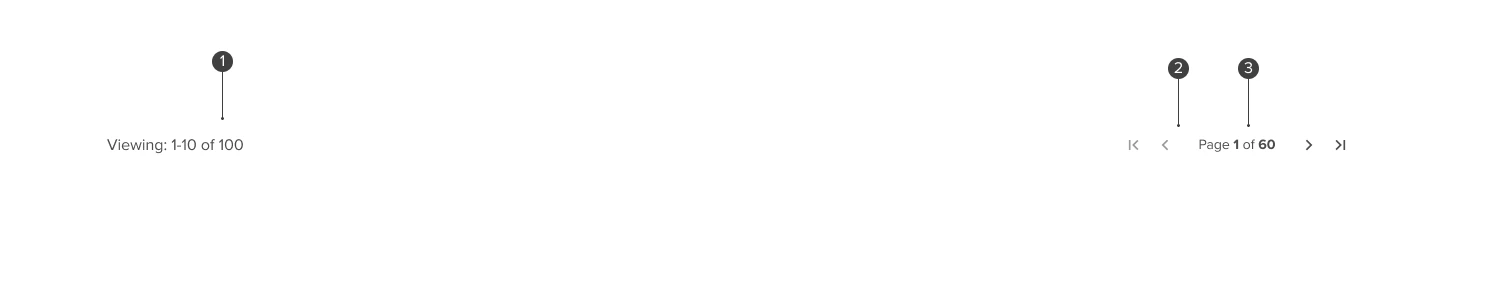

- 1. Results overview: Outlines the number of total results and the ones they are currently viewing.
- 2. Navigation: Icons or buttons that allow the user to see the next or previous page of results.
- 3. Page indicator: Highlights the page that the user is currently viewing, and clickable at standard.
Variants
Compact
Compact pagination is surfaced in context of specific components that require pagination where space is limited or when pagination is one of a range of user controls/actions, such as the Data Grid toolbar.

Before content with “Viewing” text
Header used above a table or similar use cases that combines a summary of the related result set with a compact pagination.

After content
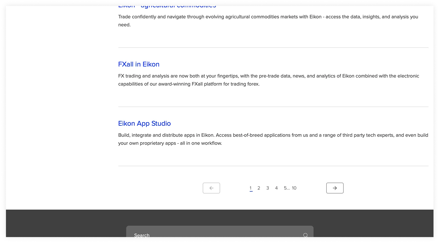
Standard “full-page” pagination most commonly used at the bottom of a page of search results.

Placement
The Pagination variants are placed above and below a set of content, this could be Search results, Cards or a table; and are centre aligned to to content the user is paginating.
Narrow
Before content
At narrow, the navigation elements turn from icons to buttons to provide a larger touch targer, and stack underneath.

After content
At narrow the number of individual page is reduced to work better in the available space.

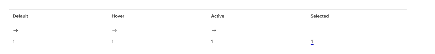
Interactive states
Outlines the atomic level interactive elements for the component.
Accessibility
Standard pagination accessibility

<nav class="Pagination" role="navigation" aria-label="Pagination">Use aria-current= true to indicate which page is current and use aria label of ‘page x of y’ aria label for a number indicating a previous or next page should be ‘go to page x of x’ Aria labels on the arrow buttons (reading left to right)
- Previous
- Next
Code the pagination as an unordered list
Focus behaviour
- Keep the focus on the icon that was acted on (e.g. If user uses keyboard focus to select ‘next’ then keep the focus on ‘next’ and use an aria-live to make a screen reader aria-live announcement of the aria label of the item it has moved to e.g. ‘page 2 of 10’)
- If there is no previous (or next) then the corresponding icon is disabled and does not take a tab focus.
Condensed pagination accessibility

<nav class="Pagination" role="navigation" aria-label="Pagination">Aria labels on the icon buttons (reading left to right)
- 1. First
- 2. Previous
- 3. Next
- 4. Last
No aria for the ‘Viewing x to y of z’ text string, screen reader will read the visible text ‘page x of y’ Code the pagination and the controls as an unordered list.
Focus behaviour
- 1. Keep the focus on the icon that was acted on (e.g. If user uses keyboard focus to select ‘next’ then keep the focus on ‘next ‘ and use screen reader announcement detailed below)
- 2. Get an aria-live to read the ‘page x of y’ text string via aria-labbeledby whenever the ‘page x of y’ text string changes
- 3. if there is no previous or first (or next or last) then the corresponding icon is disabled and does not take a tab focus.